I updated my Grafana dashboard – how to use rows and time series for a better structure
I love my Grafana dashboard to see everything important in my smart home on glance. Using rows and the modern time series panel makes it even better. Let me show you how I updated my dashboard.
Grafana dashboards
Grafana is this awesome open tool to create dashboards. I have set up integration with Home Assistant (and OpenHab before that) a long time ago. Back then I set up a dashboard including all the important smart home data and it worked very well for me.
Of course over time I learned more about what data I regularly need but also what Grafana is capable of – and that is a lot! I added dynamic content for batteries, experimented with the different types of visualizations and included my logs.
If you are looking for a full guide to quickly get up to speed in your smart home journey check out my Grafana & Home Assistant guide V2 here!
It contains all the information you need to set up you own Grafana dashboards. It includes Images, code and a full step by step guide on how to use Grafana and integrate it with Home Assistant – for beautiful and functional dashboards!
My dashboard(s) evolve all the time but recently I felt like it is getting a bit confusing with too much data and not enough structure. I decided its time for some updates and a cleanup.
Updating to time series
The first step of my late spring cleaning was to update the visualizations used to draw some temperature and humidity data. The “Graph (old)” kind of gives it away but these panel types have been replaced by a newer one: time series. For now the old one still works but the new one looks a bit better and is supposed to be more performant.
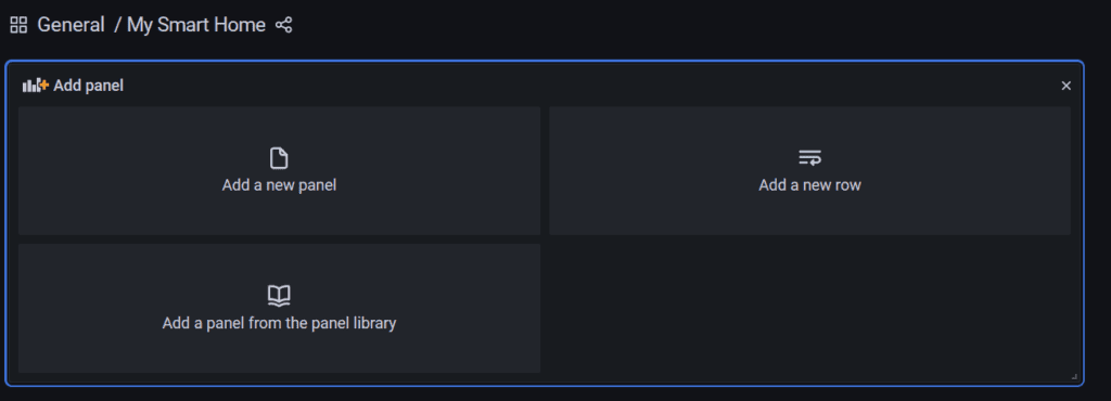
Changing the type of a panel is easy. Just click on the top bar and select “edit” or press e. Now you can change the type via a dropdown on the right side.
In case of the graphs Grafana also recommends the update via a Migrate button under the Display features. Just click the button and the type is changed while keeping everything else the same.
I also used the chance to add a couple more thresholds (the horizontal lines indicating certain important levels).
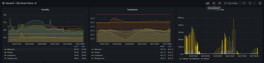
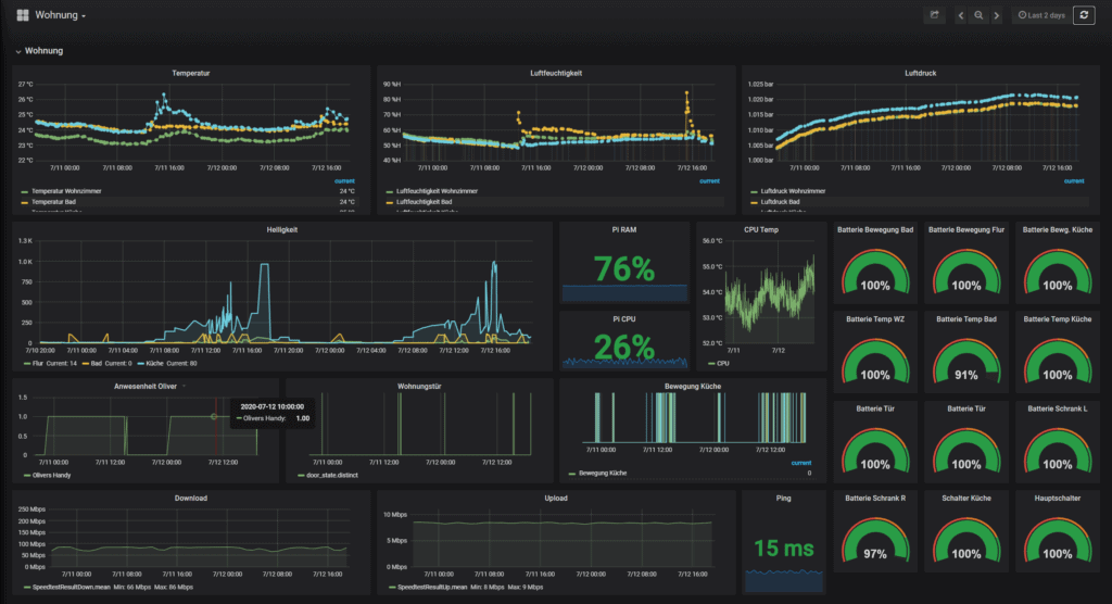
Next I got rid of the brightness diagram (not really anything important I can learn from that) and instead added some stat panels to see all the room data at a glance. Later I could also use these to link to more data.
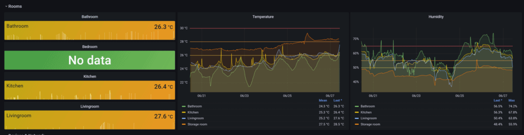
Each is just a stat with color mode “background” and thresholds added together with color scheme “from thresholds (by value)” to change their background color automatically based on the temperatures. As you see it is quite hot right now in Germany. I think this is easier to take in than the full graph showing all the rooms.
This also made me notice that one temperature sensor is seemingly damaged. I can repair it and add new batteries but it will always drop of the network after some short time.
Adding rows
To add some more structure to my dashboard I decided to also start using rows. Usually all the panels on a dashboard are just floating around only pushed into place by other panels. You will also see all the panels.
To group together similar content and hide additional data there is another kind of “meta” panel you could add: rows. Rows can be added the same way as panels and will add a small header like structure. A click on that allows you to collapse all its content.
Using these rows not only makes your dashboard more structured but can also make it faster as Grafana only loads data currently visible (with some small exceptions). I added a couple of rows and used the small edit button right next to them (shows up when you hover over it) to give them some simple names.

Temperature & humidity
The first group contains the most important data: a quick overview over the temperatures and humidity in my main rooms using the new stats added above.
Network & devices
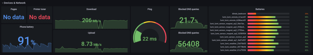
The next row contains data about my network and my devices. Data about my printer, my Internet connection speed and ping (from Openhab or now via the SpeedTest integration in Home Assistant) as well as data about the blocked DNS queries from my Adguard network wide ad blocker.
I also decided to add my dynamic panel which shows all the sensor batteries in my network. Another single stat panel shows my phones battery using the Home Assistant Android app.
Smart home server
The third row contains data about my Raspberry Pi based smart home server which is running Home Assistant and also Grafana itself. I described the simple data collection process here. Using that data I am showing CPU usage and temperatures as well as the free memory here to be able to spot issues with the server quickly.
I also have a panel here showing all the errors collected via Loki from the logs of all Docker services. Beside the logs themselves there I decided to also show the number of errors over time as well as the the current number of errors per service (for the selected timeframe).
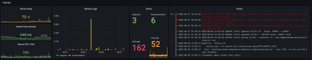
As you can see even though I stopped most of the annoying fake errors from InfluxDB there are still a lot of messages from that marked as error. I will have to take a closer look at that again.
3D-printer
The forth row collects a lot of important data regarding my small Prusa Mini 3D printer. I have started using Octoprint some time ago to be able to control the printer directly from my main PC via the network. Especially with the direct upload from Prusa Slicer that is a very neat feature.
I also integrated it with Home Assistant to push some of the data and enable some neat automations like automatic lights during printing. I am using these values here to show printer temperatures and print progress.
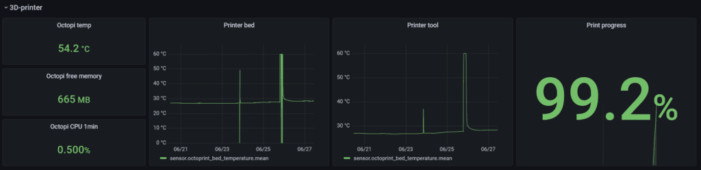
I have also set up the same data collection process for the Raspberry Pi running Octoprint (or rather Octopi) and added the data about CPU temperature & usage and memory here too.
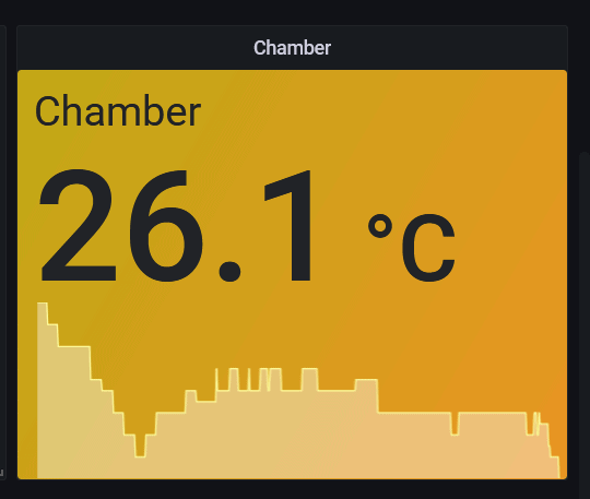
Finally there is also a small Zigbee temperature sensor (Aqara) in this room to track the air temperature in the small chamber where my 3D printer currently sits in.
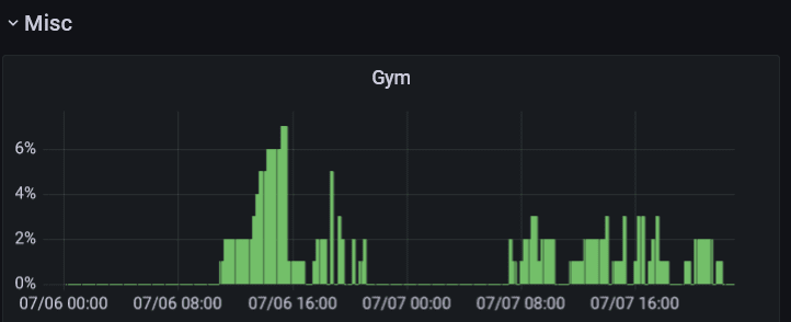
Miscellaneous
Finally there is one more row containing everything else. Right now that’s only one tracker of the occupancy of one of my climbing gyms that I built using a web scraper. I also use this place to test out new visualizations.
More to come in the future
Overall I am quite glad how this turned out. I will definitely keep building better dashboards though and share my findings. There is one project especially that might needs this coming (hopefully) soon…